SwiftUI - Creating custom Xcode library items
The Xcode library is a great way to discover and learn about available SwiftUI views and modifiers and allows you to conveniently drag and drop them to the Xcode Previews canvas without writing any code.
New in Xcode 12 and Swift 5.3, is the ability to extend the Xcode Library with your custom views and modifiers making it easier to discover and reuse views within your app or Swift Packages.
Adding views
Let’s take a look at how we can extend the Xcode library with our custom views that we can then add to the Preview canvas, just like those provided by the standard SwiftUI library.
Structuring your views
Let’s say we have a custom rounded button component that we’d like to reuse across several different views. We start by building out our custom view like any other SwiftUI view:
1
2
3
4
5
6
7
8
9
10
11
12
13
14
15
16
17
18
struct RoundedButton: View {
    let title: String
    let backgroundColor: Color
    let foregroundColor: Color
    let cornerRadius: CGFloat
    let action: () -> Void

    var body: some View {
        Button(title) {
            action()
        }
        .padding()
        .background(backgroundColor)
        .foregroundColor(foregroundColor)
        .cornerRadius(cornerRadius)
        .font(.title)
    }
}
It is crucial to pay attention to the structure of our code to make it reusable in different contexts. From the example above, instead of hardcoding all the modifier values, as usual, we declare properties and assign them to the modifiers. By doing so, we can now configure and use our custom button with different configurations throughout our UI.
Creating an Xcode LibraryItem (for views)
The first step is to create a type that conforms to the LibraryContentProvider protocol:
1
2
3
struct XcodeLibraryContent: LibraryContentProvider {
  ...
}
The LibraryContentProvider protocol has two requirements:
viewsproperty - to extend the views Xcode librarymodifiersfunction - to extend the modifiers Xcode library
Both return an array of library items ([LibraryItem]) to extend the Xcode library.
Xcode will automatically scan our source code for types conforming to the
LibraryContentProviderprotocol and add them to the library without having to build or run our code.
In this section, we will focus on extending the views section of the Xcode library by creating a new LibraryItem and assigning it to the views array:
1
2
3
4
5
6
7
8
9
10
11
12
@LibraryContentBuilder
    public var views: [LibraryItem] {
        LibraryItem(RoundedButton(title: "Button",
                                  backgroundColor: .red,
                                  foregroundColor: .white,
                                  cornerRadius: 12, action: {

                                  }),
                    visible: true,
                    title: "Rounded Button",
                    category: .control)
    }
The first argument when initializing the LibraryItem, is the view we want to add to the library, in this case, our custom button RoundedButton. Here we pass in the default data that will be used once the view is added to the Previews canvas.
The default values you specify is really up to you and serves to act as a starting point that can be customized based on the insertion context.
@LibraryContentBuilderis a new function builder for generating arrays ofLibraryIteminstances without requiring full array literal syntax.
And just like that, we have now extended the Xcode library with our custom rounded button view.
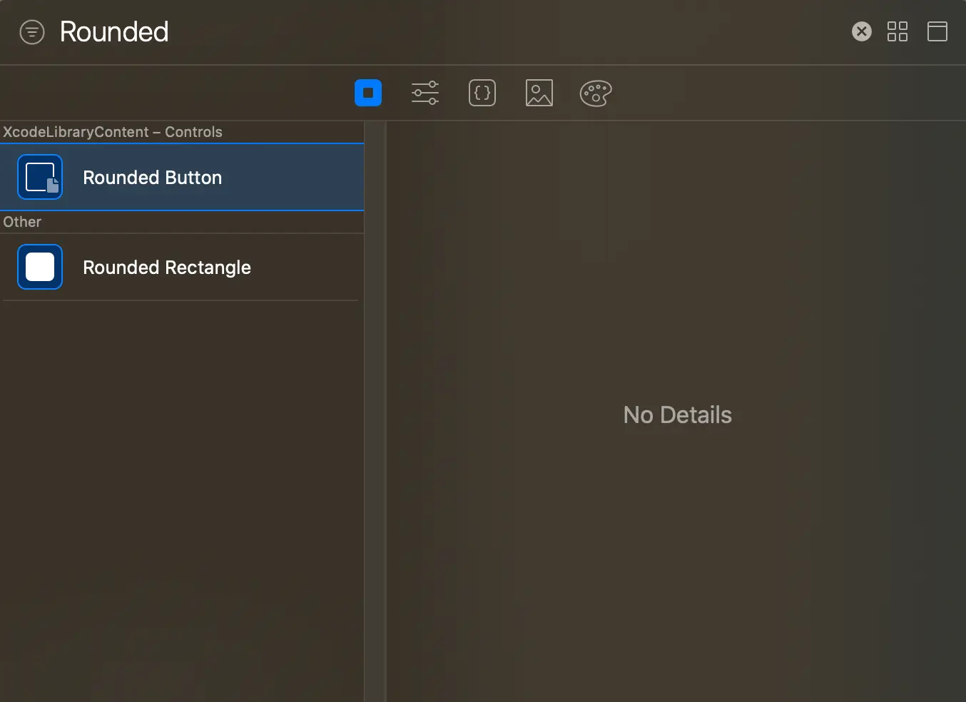
Click on the “+” icon in Xcode to open the library (⇧ + ⌘ + L) and make sure you have “Show the views library” selected.
 Our custom rounded button is now showing up together with all the other system provided views.
Remember, views do not have to correspond to library items one-to-one, meaning that you can have multiple library items representing views in different configurations.
Adding view modifiers
Just like views, we can also extend the Xcode library with custom view modifiers and is extremely useful when you want to group several modifiers into a single modifier that you can reuse with different views.
Extensions vs. View Modifiers
With extensions, we can encapsulate common layout and styling logic that can be reused across many views, they do however have limitations.
Using view modifiers, we can leverage @State and other View-related behavior and apply this behavior to arbitrary views.
Let’s create an extension on View for a specific style variation of our custom rounded button:
1
2
3
4
5
6
7
8
9
extension View {
    func rotated3DButtonStyle(shadowColor: Color) -> some View {
        self
            .rotationEffect(.degrees(-10))
            .rotation3DEffect(.degrees(14), axis: (x: 1, y: 10, z: 0))
            .shadow(color: shadowColor, radius: 20, x: 0, y: 0)

    }
}
Creating an Xcode LibraryItem (for view modifiers)
To add our custom view modifier to the Xcode library, we yet again need to create a new LibraryItem and return it as an array in the modifiers function of the LibraryContentProvider protocol:
1
2
3
4
@LibraryContentBuilder
    public func modifiers(base: AnyView) -> [LibraryItem] {
        LibraryItem(base.rotated3DButtonStyle(shadowColor: .blue))
    }
Here the first argument when initializing the LibraryItem, is our base. The base enables Xcode to figure out which part is the modifier and which part is the view it modifies.
So, when applying a modifier to Image, the base will be Image. In our case, given the example above, we’re applying a modifier to View, so our base will be AnyView.
Again, just like that, we have now also extended the Xcode library with our custom view modifier.
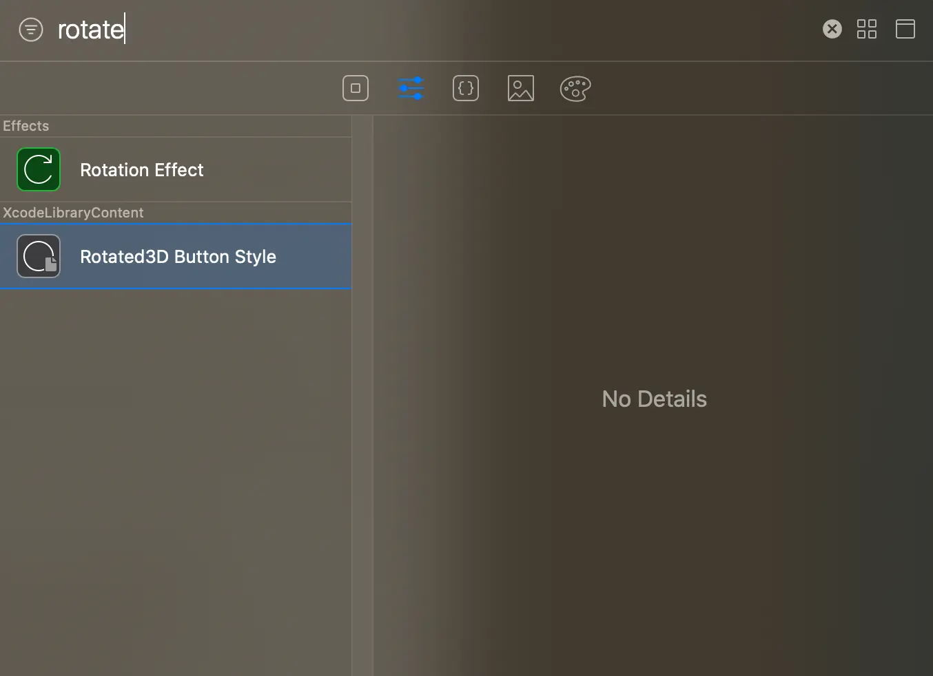
Click on the “+” icon in Xcode to open the library (⇧ + ⌘ + L). This time around, make sure you have “Show the Modifiers library” selected.
 Our custom view modifier is now showing up together with all the other system-provided view modifiers.
What about Swift Packages?
Since Xcode automatically scans all your source code files for LibraryContentProvider code, including all dependencies you might have, it also works great with Swift Packages.
Summary
The Xcode library is an easy way to discover available SwiftUI views and modifiers that we can easily add to the Xcode Previews canvas without writing any code, enabling rich visual editing of our apps.
Extending the Xcode library with our own views and view modifiers is very easy and requires little effort.
